Fake plastic…

Trees No! Puffins!
Fake Plastic Puffins!

Wait, what?

Remember Radiohead telling us about Fake Plastic Trees?

Her green plastic watering can
For her fake Chinese rubber plant
In the fake plastic earth
That she bought from a rubber man
In a town full of rubber plans
To get rid of itself

Here they are doing it at Glastonbury in 2003. (You may remember that I was there.)

And let’s not knock it, because it’s a great song.
But we’re not on about Fake Plastic Trees. Fake Plastic Trees are so passé.
You want to know about the puffins; the Fake Plastic Puffins.

w704

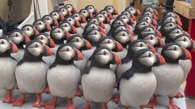
The FPPs are being deployed on the Calf of Man – that’s the small uninhabited island off the southwest coast of the Isle of Man (just next door to the Chicken Rock, actually). And they’re being deployed with a purpose – to encourage Real Meaty Puffins (RMPs) to come and breed again on the island.

Puffins are both gregarious and notoriously unadventurous; they won’t try new nesting sites (technically, puffins live in burrows, not nests, but still…) if there aren’t already some puffins there. But it seems that they don’t need to be RMPs – they can be FPPs and still have the same effect.
Puffins aren’t ever so observant and are a bit daft, it would seem. Aukward.

Manx National Heritage are pretty excited about being involved in the project, and have promised to keep us updated on its progress. I follow them on Facebook, so I’ll pass any news on to you. I know you’ll be interested.

(Thought: Maybe I need to install some Fake Plastic Blog Readers here…? Hmm…)

Meanwhile, here’s another great post about Puffin recipes.
You’re probably best to use RMPs rather than the FPP version for these though.

Mantis

We had a large visitor to our backyard this lunchtime:

This one was ever so edgy, so was quite difficult to photograph. His skittishness is probably how he’s managed to get so big.

Despite using a really decent camera, to be honest, I don’t think that this compares with some of my other photos of mantises (mantii?) such as this one on a football, this one on a wall and – infamously – this one devouring a gecko:

Ah, happy days (though obviously not for the gecko).

Going critical

Nothing good comes from things going critical. Nuclear power plants are probably highest up the list of things which are bad when they go critical, with toddler tantrums pretty close behind.
Critical isn’t good situation to be in. Critical is… well… critical.

Unless something rather remarkable occurs very shortly, when their capacities are measured again on Monday, Cape Town’s dams will have fallen below the “critical” level of 30%.

Fullscreen capture 2016-04-14 100229 AM.bmp

It’s obviously an arbitrary level that they’ve chosen to call “critical”, and quite what happens when we cross that threshold is unclear, although we have been told that we shouldn’t panic. But then, that begs the question, why bother having a “critical” level in the first place if nothing changes once you find yourself below it?

After all, very little happened when we crossed the legendary “careful now” 70% margin, nor the distinctly worrying “er… guys…?” 50% line.

I do hope that the city council have got this all in hand…

Barry Wood, the city’s manager of bulk water supply, told the council’s portfolio committee “We don’t have to be too concerned, provided that it starts to rain.”

Ah. That’s all ok then.
Colour me completely reassured.

First & Last

Nice idea this. The very first and the very last frames of popular series.

I’m not a big fan of these sorts of dramas – I’ve only ever watched one of these (Twin Peaks), and I can confidently say that I’ve never watched a single episode of any of the others. Too much commitment.

[vimeo clip_id=”161613650″ width=”680″ height =”382″]

You’ll have to watch it at least twice, because you miss details from either one or the other when you watch it first time.

You can see that Lost and Sons of Anarchy knew that someone was going to do this one day.
Good call.

Super Simple

This looks like I’m being lazy again (it’s not deliberate), but I just found this interview really interesting, and I wanted to share. It’s with Mark Farrow, who has been designing Pet Shop Boys record (CD, tape, album) covers for ever so many years now. He’s just done the same again for their latest one, Super, which I’m currently listening to (spoiler: it’s not misnamed).

download

I’m not into “design”, but I really like the idea behind this latest cover:

This time we went pop art, a fluorescent circle containing the word “SUPER” in a contrasting fluorescent colour. Then each format, CD, LP and digital, was given its own fluorescent colour scheme. The different music streaming services even have their own colour schemes. These colour schemes then come together in an animation of clashing colours used for online advertising and digital poster sites. Unhinged and brash, yes, but it also feels considered and complete as a campaign.

And yes, look – they’re all different – here’s Simfy and the Wikipedia entry:

  Screenshot_2016-04-04-11-55-57       Fullscreen capture 2016-04-04 115656 AM.bmp

So let’s get this straight… This guy has been a designer – a successful designer – for at least 30 years (he did the cover for West End Girls back in 1987) and he has come up with a circle with a word in it? A word that he was given. He didn’t even have to think of the word. Seriously, aside from the circle (which is hardly a complex addition), could it actually have been any more simple?

No. No, it couldn’t.

Thing is though, it’s absolutely brilliant. And even those true cynics amongst us have to take a seat and just admit that sometimes less is more. Maybe you need to be a top class designer – supremely confident in your ability and reputation and in your clients’ belief in your work, to be able to challenge them and their fans with something so audaciously basic and fundamental.

It’s so unpretentious that it might just be the most pretentious thing I’ve ever seen.

And I love it.