Ugh. Sp0.0nsorship

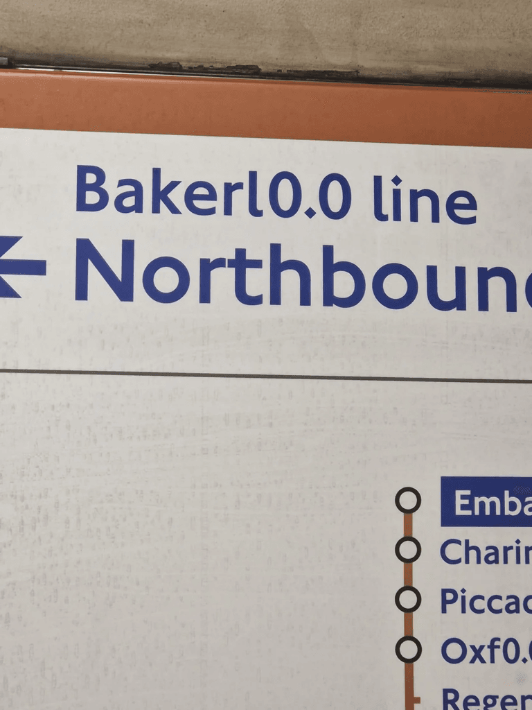
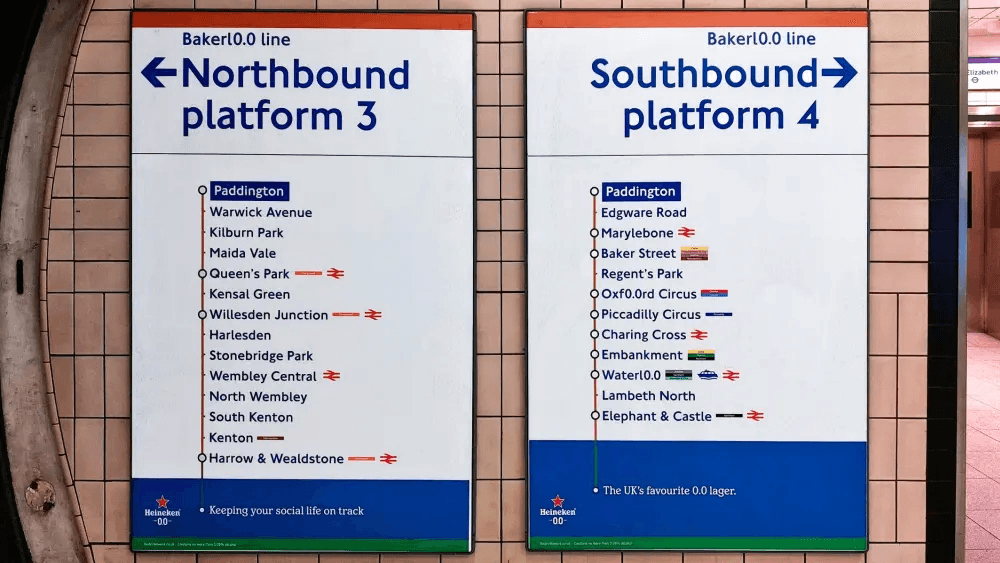
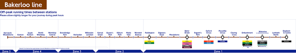
I learned yesterday that all the London Underground stations and lines with a double O in their name (and some popular ones that don’t even have a double O in their name) are now sponsored by Heineken 0.0.

It tastes terrible, by the way.

But that’s not really the issue here. Is this a bit of corporate marketing fun, or is this actually a bit rubbish?

Answer: It’s both.

What?
Oxf0.0rd Circus doesn’t even work. If you already have to start making crap up after you’re done with Bakerloo and Waterloo, then this is a campaign that probably shouldn’t have got further than the drawing board.

And to those who say that it’s not confusing and just a bit of harmless fun, that map advert above on the left has got Kilburn Park and Maida Vale in the wrong order.

Well done!
Is this a lack of effort? A lack of attention? A lack of just… caring?

Whatever. Maps are meant to be maps: to help you get from A to B (or to 0.0) as easily and clearly as possible. They aren’t meant to be adverts.

And yes, there are bigger things to be concerned about going on in the world at the moment, but I (and hopefully you) have the brain capacity to be concerned about more than one problem.

No. Less of this kind of thing, please.

Axonometric station maps

You what what?

Axonometric projection is a type of parallel projection used for creating a pictorial drawing of an object, where the object is rotated along one or more of its axes relative to the plane of projection.

Got it now? No. No, you haven’t.
And so, because a picture is worth a thousand words, here’s a picture.

wood-green

[click it for bigness]
It’s an axonometric representation of Wood Green Underground Station. So now you can see what I mean.
Ian Mansfield of ianvisits.co.uk documents the results of a Freedom of Information request to TfL. They were obliged to hand over axonometric representations of all the stations on the London Underground, which he shares on the link above.

Look, Wood Green is a simple station, out of town (so not too deep) (12.8m) and on a single line, perfect for illustrating what an axonometric map is. Get into some of the bigger stations though and things get complicated:

Westminster:

westminster

or Canada Water:

canada-water

I suppose that these will mean more to you if you’re a Londoner, or if you used to live there. And not all the stations are shown (indeed, there are actually only 120 out of the 270 on the system), but it’s still quite fun to look at.

No?

Just me then.

How Corpses Helped Shape the London Underground

I’ve had this Gizmodo article on my devices waiting to be read for some time. Now I have read it and it’s amazing. So you should too.

Some incredible stories about how bodies were (or weren’t – eww) disposed of in London over the past few hundred years, and how that influenced where and how the Underground network could be built.

It’s fascinating stuff.