
Today’s post is a bit of a test of the new WordPress 7.0 which I downloaded and installed this morning. If you’re reading this, it worked.
Except that there is a problem that only I can see: the backend really isn’t very pretty.
I suppose you could say that for a number of things (and people), but for an app that has been probably overly indulgent on appearance above function on the last few updates, this is a real let down.
Unless I’ve just missed a setting I need to tweak?
My font is tiny, my kerning is all wrong, and it’s actually rather difficult to read. Thankfully, I’ve checked, and none of these issues seem to be occurring on the front end of the blog (the bit you’re reading at the moment).
All you’ve got to contend with is the quality of the stuff I’m writing.
And yes, I recognise that that’s not great either.
But.
Let’s pop in a quick image of an Agulhas moonrise, meaning that you don’t have to look at so much writing.
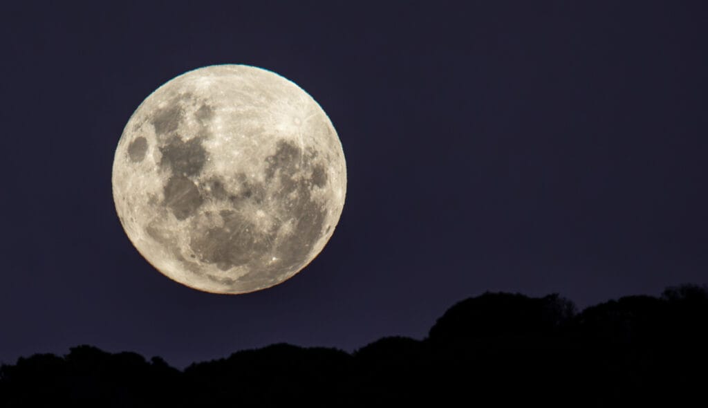
Taken last time we were down there – handheld, nogal – and a good reason why there really wasn’t much beach left to walk along at high tide.
Anyway. I need to go and search (but with what terms?) for what’s gone wrong here, because it really isn’t conducive to producing decent content.
More tomorrow.
EDIT: Hmm. It has made a difference to the font on the front end as well.
That’s great. Exactly what an update shouldn’t do.