Day 448 – More on graphs

Sometimes (often, in fact), displaying something on a graph can give far more context and relay far more understanding than using words or even numbers. That context and understanding might not be good news, but maybe in those cases it’s even more important to get the message across as quickly, efficiently and straightforwardly as you can.

This graph should do exactly that. And for those exact reasons.

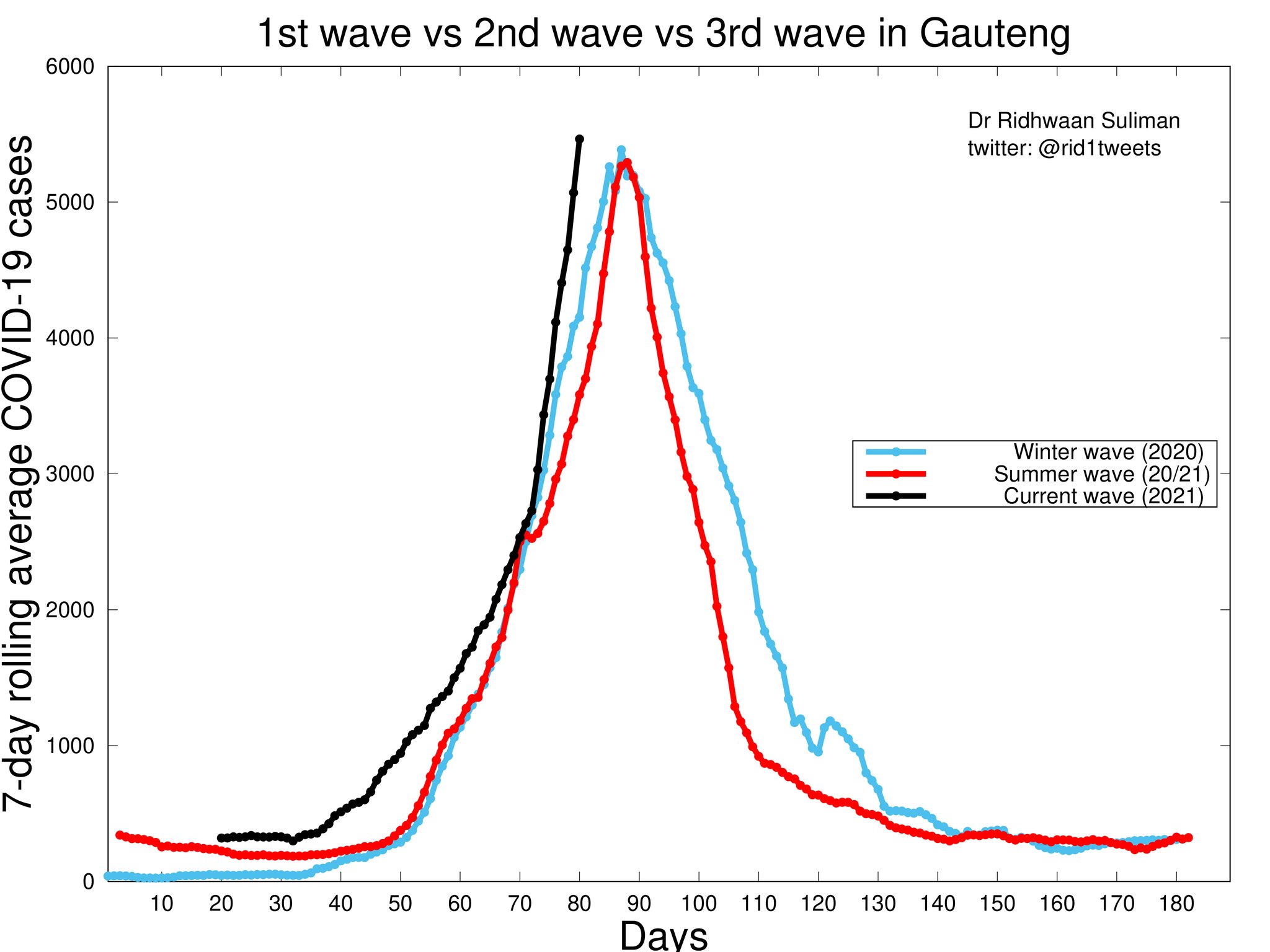
Nearly 8,000 new cases in Gauteng reported yesterday. The highest number ever recorded there. Driven primarily by urban Johannesbeagle and still increasing dramatically, as the black line shows. And the likelihood is that this represents just the tip of the iceberg, with plenty (or more) anecdotal evidence that the community prevalence is actually far higher than those cases being recorded.

And you don’t have to be rocket scientist (or actually even a scientist at all) to consider what’s above and then look at these (smaller, but still equally valid and scary) graphs and see what’s coming for Cape Town soon.

Another week? Maybe two? It’s a pretty unpleasant thought.

While we’re on graphs and their significance, I thought I’d share this – adapted from a tweet by Jens von Bergmann, and used with permission.

Same graph, differing significance depending on your education/viewpoint/desired narrative.

But I guess that one point you can take away from this is by applying it to the graph at the top of the page and – once again – coming to the conclusion that things are looking very bad right now.

Graphs: rid1tweets and mediahack

Data Maps of London

Really interesting, this one. And nice to blog on a busy day because the explanatory work and analysis is all done for me on this BBC Magazine webpage. There are some fascinating insights into London life in the twelve separate infographics, maps and graphs, but there were two that stood out for me.

Firstly, this one, depicting the average monthly rents along the Central Line:

_78781053_976generationrente

Not just because of the obvious trend of increasing rents as one heads towards the centre of the city, but also because of the clever way it has been expressed. And Bond Street, fully 30% ahead of its nearest rivals along Oxford Street, despite only being about a kilometre from each.
Right now, £4,200 is R74,251.04, by the way. For a two-bedroom flat. Per month.

Wibble.

So how come so many young, single people can afford to live in the centre of London? Because that’s what they do:

_78784823_976newrelationshipstatusb

And then as their lives become bogged down, sensible and boring complete and filled with the love of another, and kids and beagles come along, they move further out so that they can maybe afford a small garden for their beagle to dig up and destroy.

As an indication of how we conform to the way our Western lives are supposed to work, it’s almost too perfect, isn’t it?

There’s more to see on that link: shipping, flickr, lost property, football clubs – it’s just really interesting if you like data and numbers. And especially so if you have a London connection, I suppose.