
As we look at the latest figures from Gauteng, ground zero for SA’s Omicron-driven Fourth wave (again via @rid1tweets), we see this scary graph:
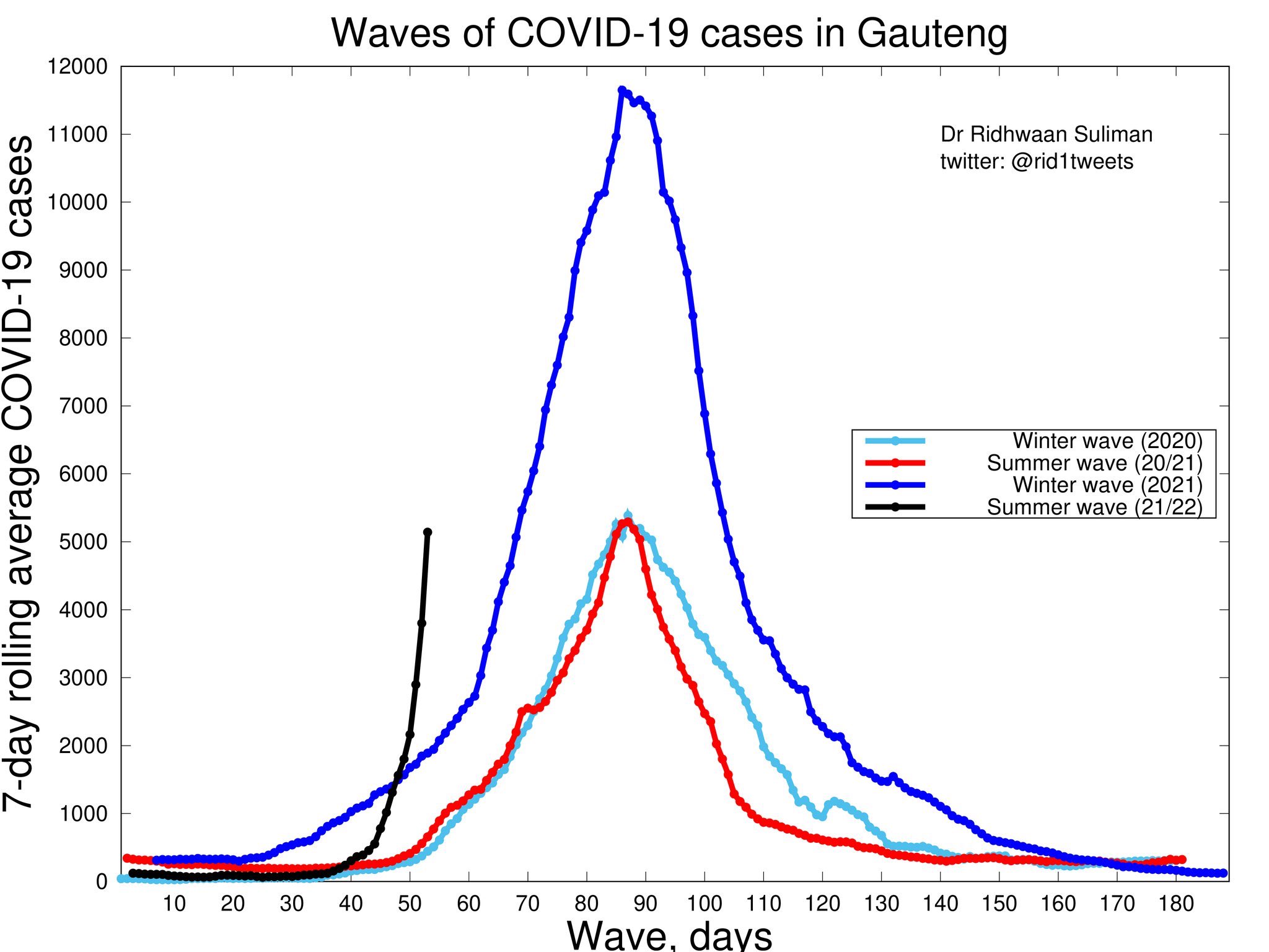
The hospital and death figures always lag a week or two behind, so really, all the we can say about Omicron at the moment is that it’s spreading like wildfire. Given that the conditions at the start of each of the three previous waves was pretty much the same, and that we should now have some protection from (some) previous infections and (a bit of) vaccination, we’d wouldn’t expect to see the black line rearing up like a pissed off Cape Cobra in the Overberg, rather it should be flatter, like a mole snake on the R27 West Coast Road.
It’s so steep because the virus is spreading very quickly, which suggests that it is very infectious. And that would fit with the (anecdotal) evidence I’m seeing in my friends and friends of friends in Cape Town. Every second person has suddenly got it: some not so bad, some bad, some vaccinated, some not (and some unknown), some previously infected, some not, some careful, most… you know. Mmm.
But it wasn’t here a week ago and now it’s everywhere.
Increased infectiousness = increased transmissibility.
And so the gradient of that black line is very bad news. Not least because of this:

Yep – a low percentage can still be a very big number if it’s a low percentage of a huge number.

Delta looked like a variant that you wanted to avoid because it has/had some nasty morbidity and mortality associated with it. Omicron looks like one to avoid because it has some really nasty transmissibility associated with it – and we don’t know about the morbidity or the mortality yet.
But either way, it’s not looking good.